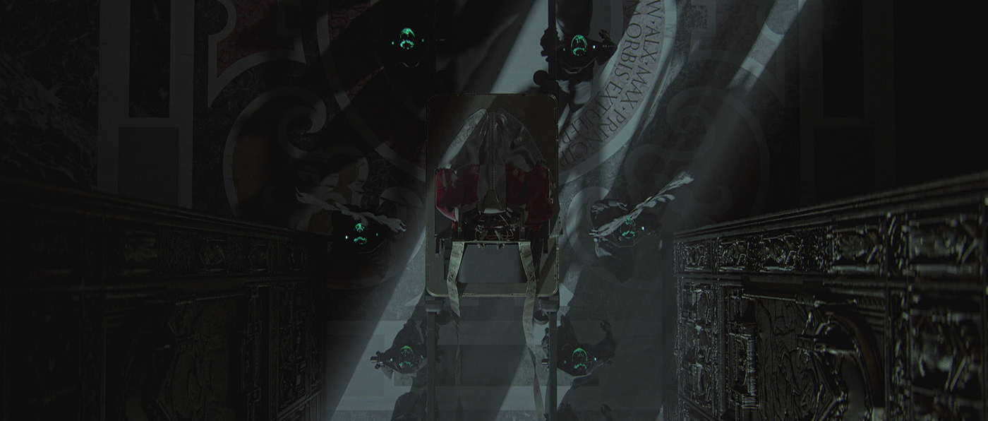
Ciclope Festival Titles by Le Cube
In a colorful and nostalgic generational coming of age story created for Ciclope Festival, Le Cube pays homage to the kids that grew up to shape our current artistic and creative worlds.
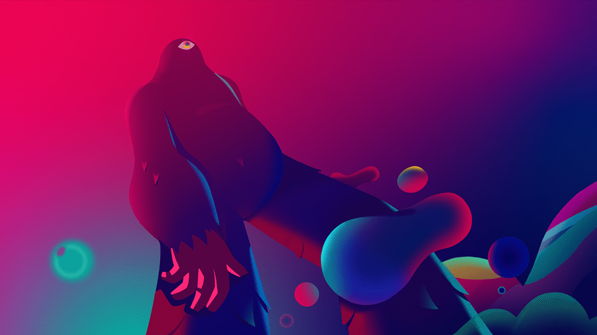
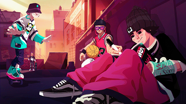
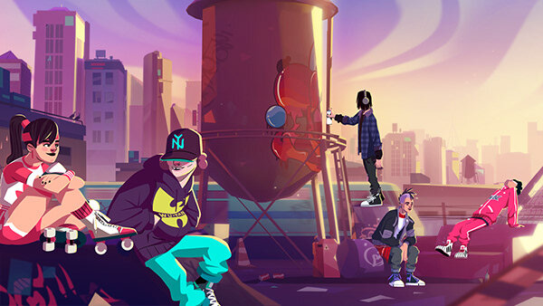
In a colorful and nostalgic generational coming of age story created for Ciclope Festival, Le Cube pays homage to the kids that grew up to shape our current artistic and creative worlds.
Ilka & Franz are a German/ Austrian photo & director duo based in London (UK). Their work blurs the lines between portraiture and still life and is often humorous with an unexpected twist. While their unmistakable use of colour is vibrant and bold, their conceptual undertones are often subtle and of child-like naivety. Ilka & Franz draw their inspiration from pop culture, kitsch and surrealism as they put a playful spin on the ordinary. The duo work on editorial and commercial commissions in the UK and abroad.
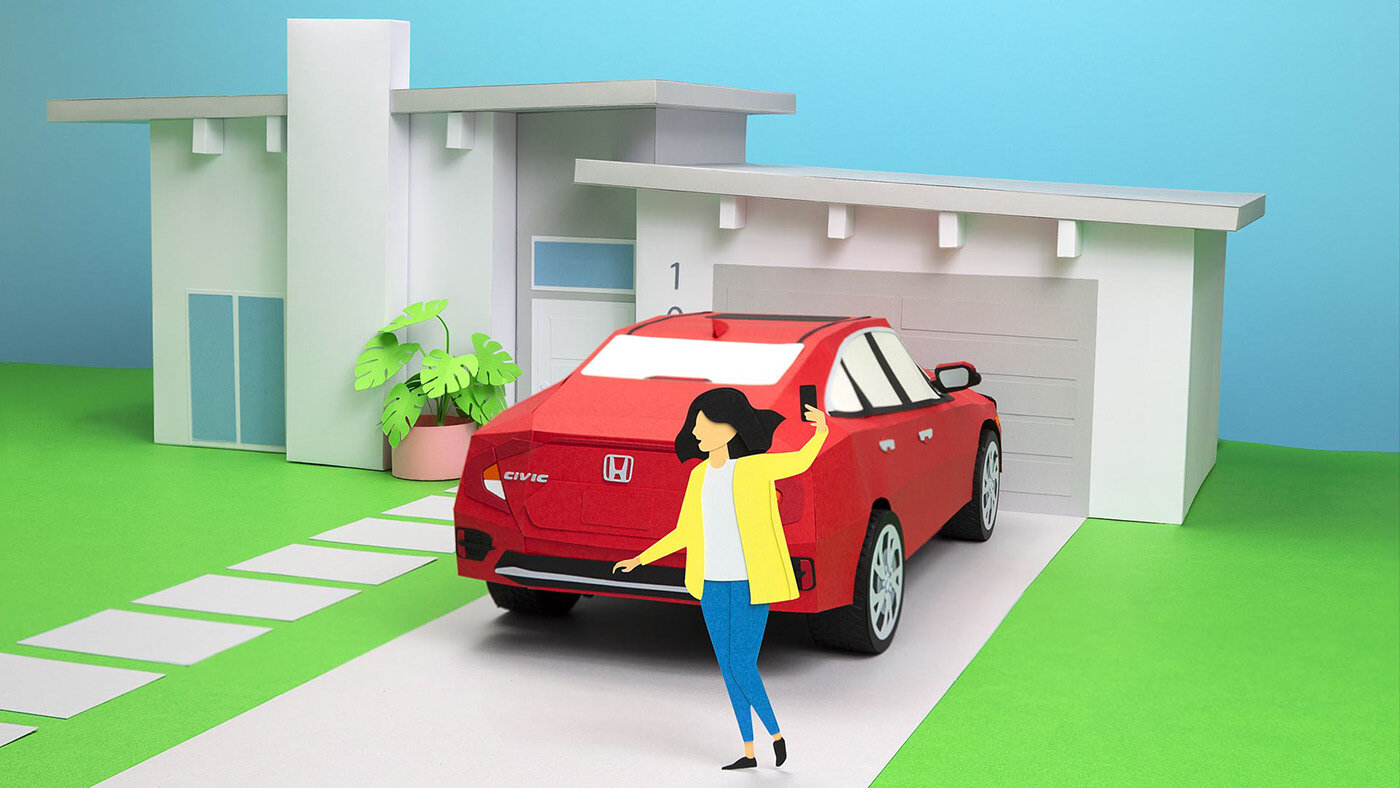
HONDA commissioned Noelia’s Lozano studio to create some papercrafts animated sets for their Summer Special campaign. “All based on the first time doing something with your Honda Car, in this case we had the task to focus on the new Honda Civic shiny red car. So all the compositions and stories move around this baby hero.” - shares Noelia on Behance
A fashion photography and video production company TGImage based in Shanghai, China, shares their latest commercial photoshoots made for leading editorials


“A Mach unit characterizes flight speed compared to the speed of sound. We use the Mach unit to characterize our graphics.”
DISCO is a short film from South African casting agency, DISCO, showcasing in a superb way, what’s happening in the strange and wonderful world of casting direction…

“In casting, our world is a theatre of the unseen. We live behind the curtain. This is a celebration of the casting arena in all of its intimate awkwardness, secrecy and flashes of flamboyance, where we delight in the unruliness of human beings.
As casting directors we present a fantasy version of how a story can be told. For the film, we stepped into that fantasy by reimagining and reenacting the jobs we’ve been asked to cast on. We dreamt up the roles these characters would go on to play in our ideal world. It was about casting ourselves as the audience, letting go and learning about who we are. The films show us how we see the world.
Good casting direction is presenting the unexpected and making it work. A lot of the magic of our trade is conjured by happy accidents, surprises and mischief. The imperfections, the intimate off-screen moments before and between a session, the mistakes and blemishes – these are the things that enliven our work.”
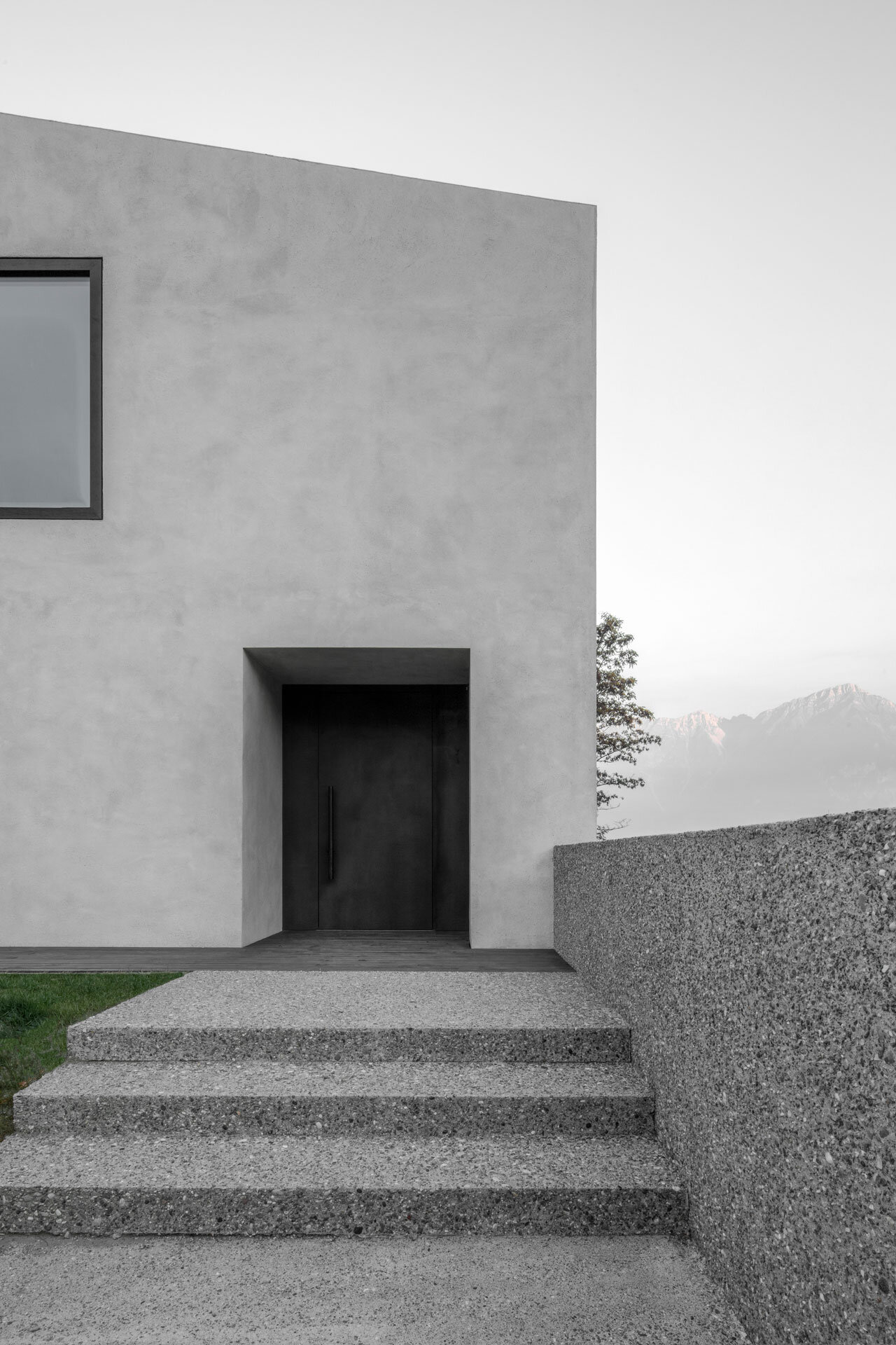
In the Austrian countryside a decidedly modern farmhouse is enhanced by traditional elements. Villa B is a two-storey home that feels perfectly settled against the idyllic fields and mountains of its locale. Villa B was designed by Bergmeisterwolf, an architectural office based in Italy.
Surrounded by sprawling farms and patches of woods, the form of Villa B draws from traditional farmhouse architecture. Dotted across the countryside, farmhouses typically side with the form follows function mentality; in short, they are practical dwellings suited for housing those who work on the land. Simple design features such as sloped roofs protect the homes from falling rain and snow. Wood cladding most often covers the exterior walls: a no-nonsense material that is readily available in rural settings. The farmhouse we know today may have humble beginnings, but its characteristic form continues to be relevant for regional architecture. Read more on @minimalissimomag
The gloom ripples while something whispers,
Silence has set and coils like a ring,
Someone’s pale face glimmers
From a mire of venomous color,
And the sun, black as the night,
Takes its leave, absorbing the light.M. Voloshin
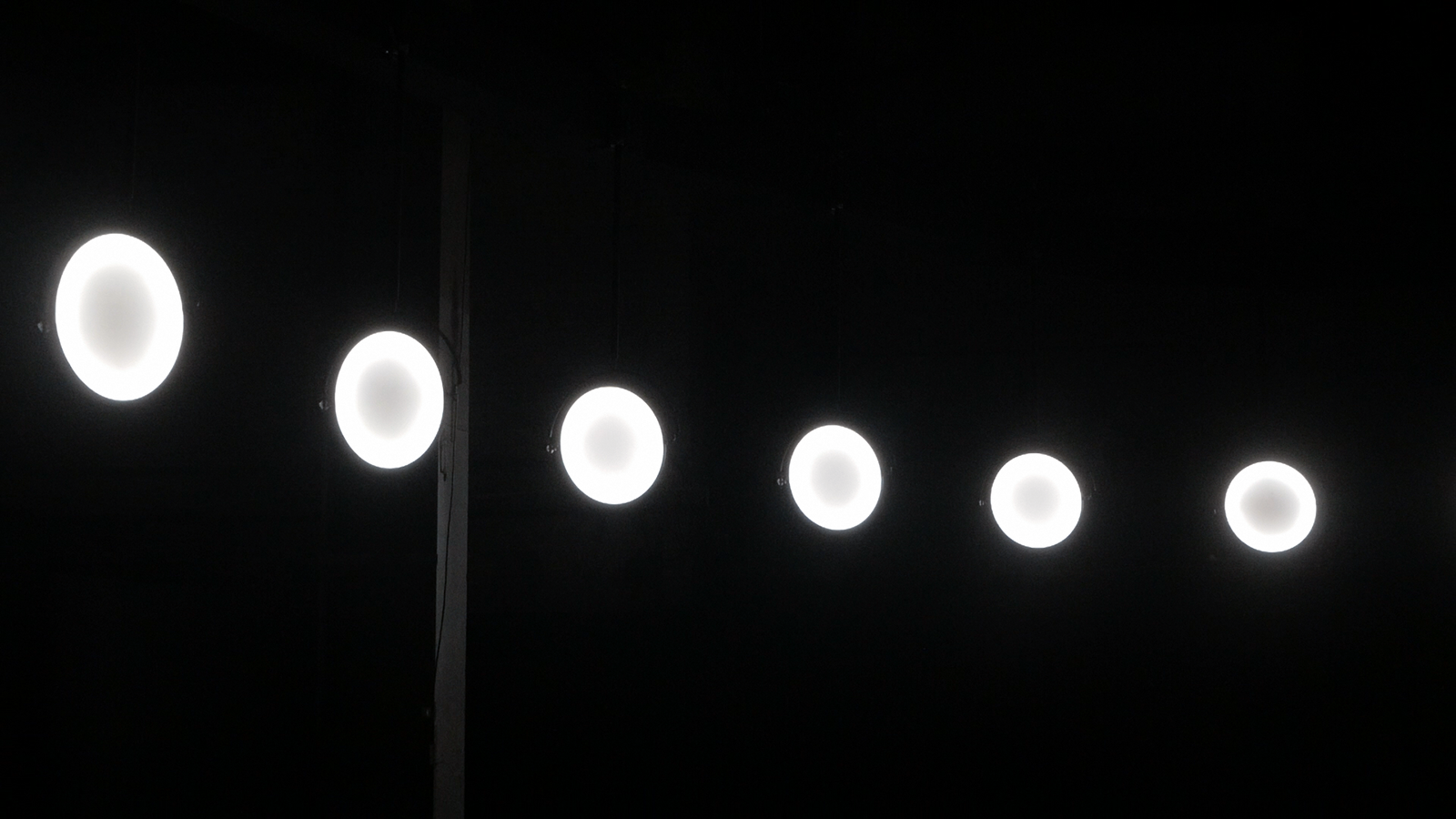
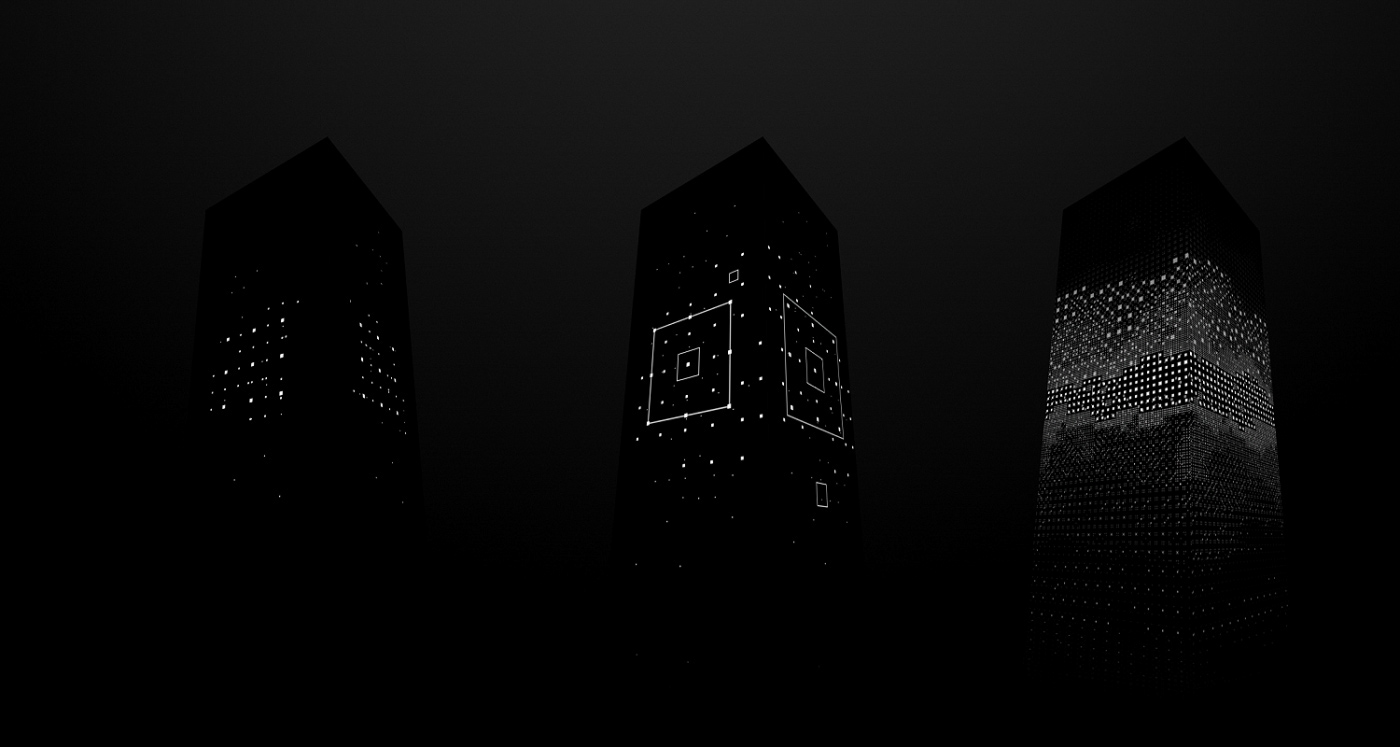
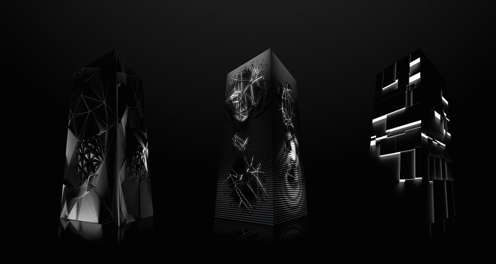
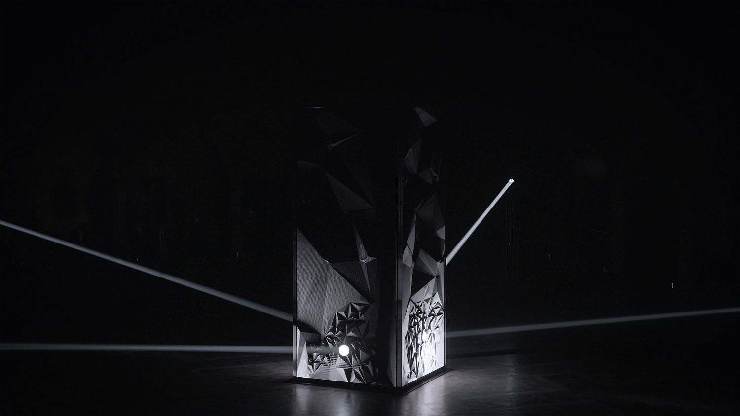
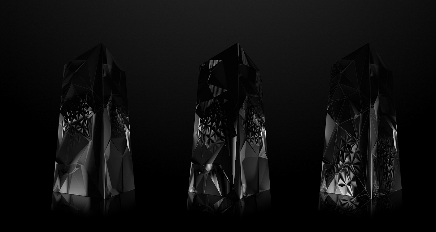
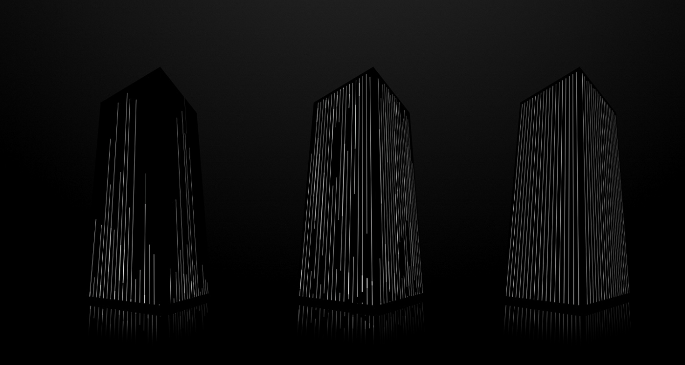
The kinetic light installation "Duel" takes inspiration from the idea that conflict can act as a driving force. The concept of duality finds expression in the installation’s achromatic color scheme, as well as in its construction and form.
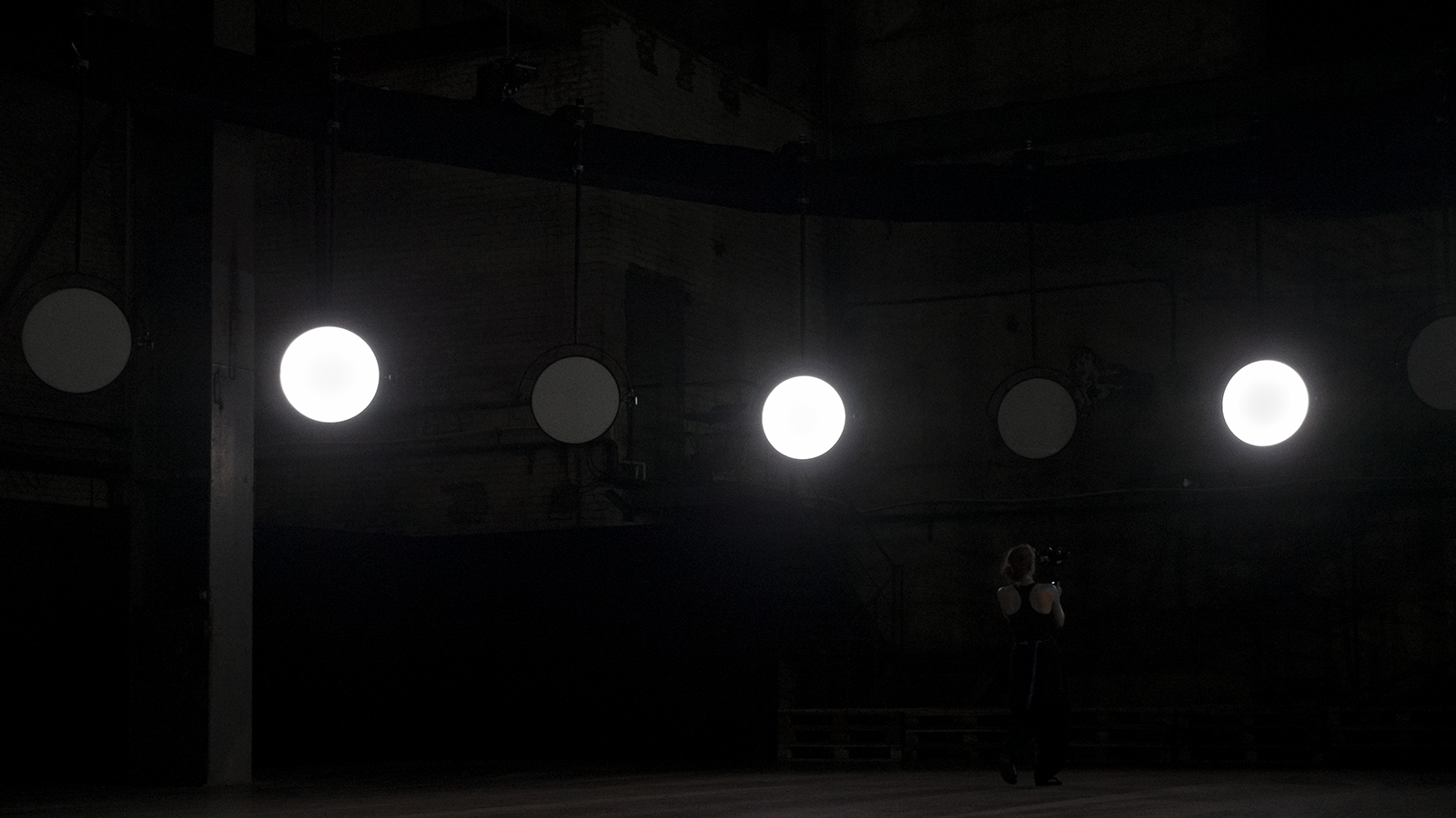
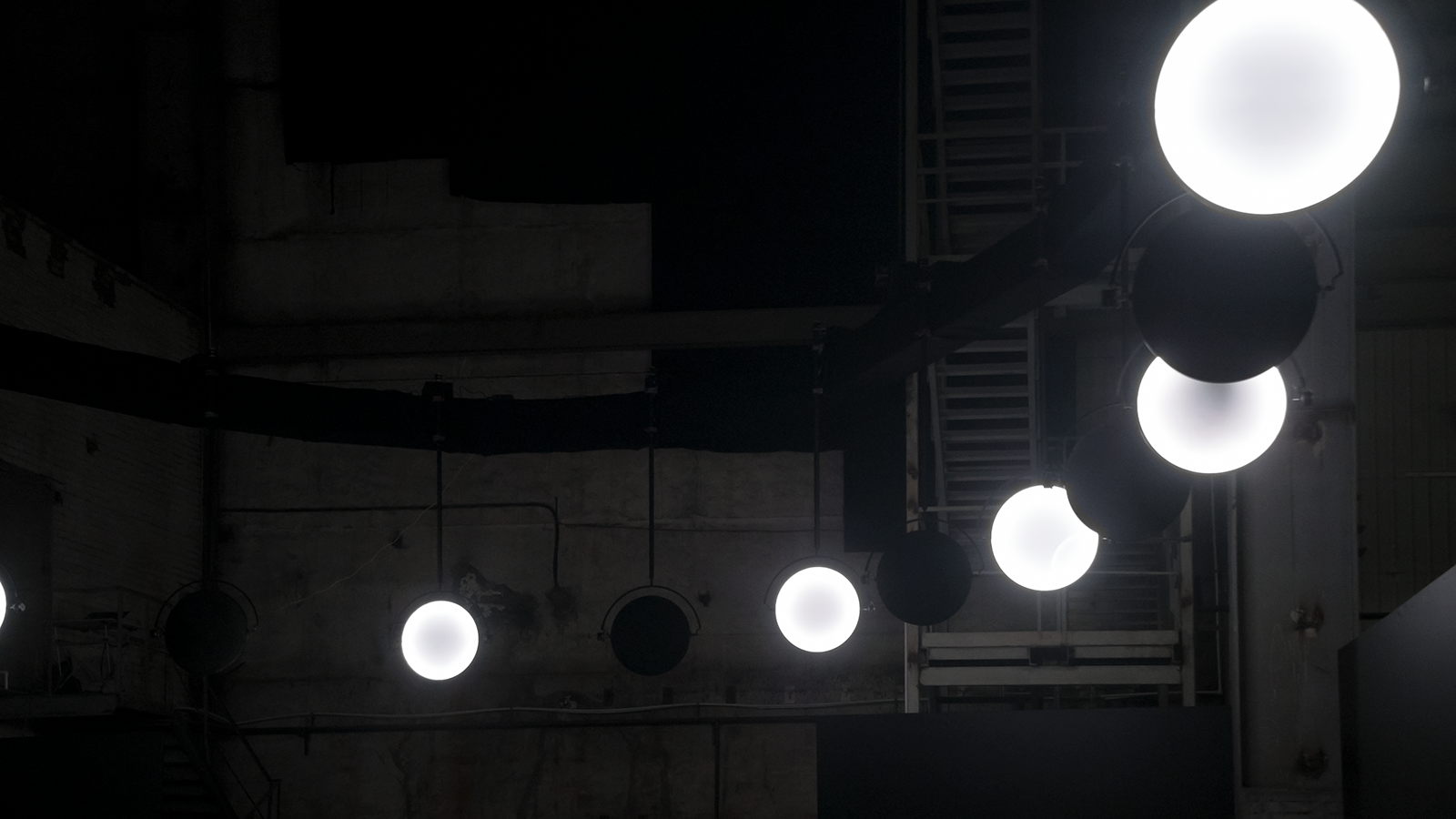
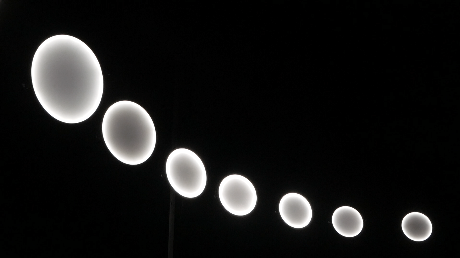
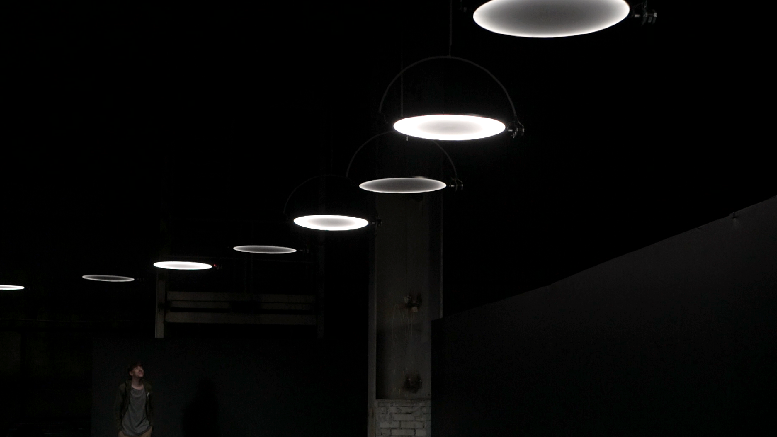
The installation’s main elements are 16 discs, all nearly flat and each with two opposite sides: one dark and one light. The opposites are in a constant state of “dueling” with each other, and all their attempts to reach one another instead result in continuous three-dimensional rotation. One recognizes in this movement the characteristic twists and turns of a coin that has been tossed into the air. The die has been cast, but the contest has not been decided yet. The discs’ movement through the air creates choreographed scenes with lights and shadows moving across space – the byproduct of a confrontation between two opposite and yet interconnected principles.
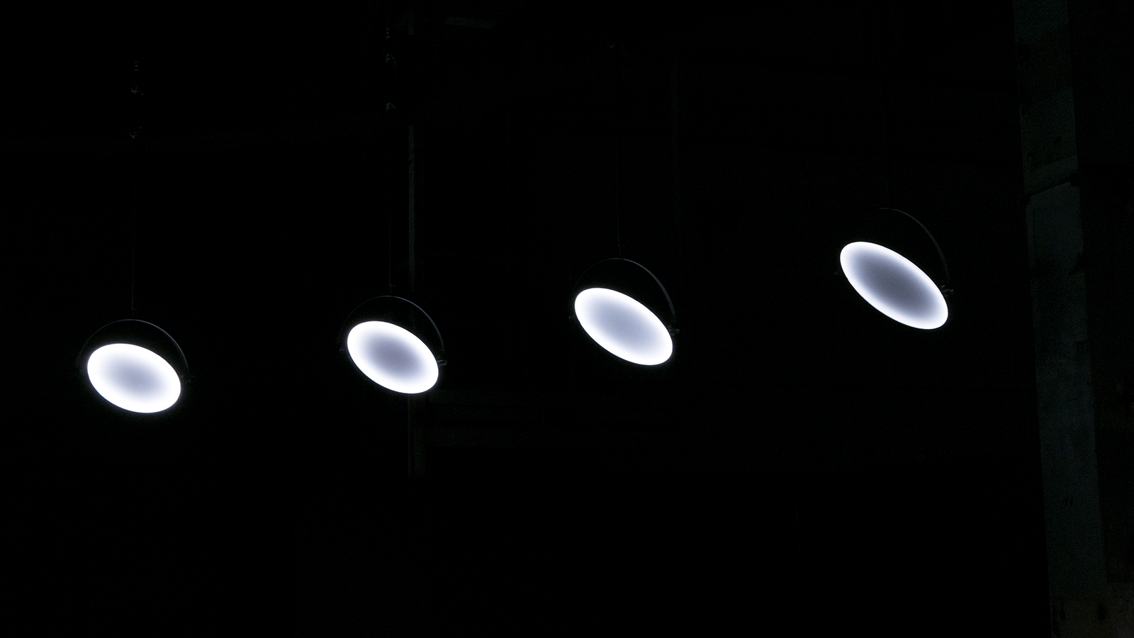
The installation was first presented on July 27-28, 2019 at the Present Perfect Festival in St. Petersburg in a separate space in the former factory. 16 motorized light elements were fixed to a 30-meter-long structure assembled in the form of a parabola and then driven in a smooth synchronous movement by custom created software.

Credits
Concept, production and video: VOLNA
Engineering: Alexey Belyakov
Mechanics: Viktor Smolensky
Camera/photo: Polina Korotaeva, VOLNA
Special thanks: William Cohen, Michael Gira, Igor Matveev, Alexander Nebozhin, Jason Strudler, Ivan Ustichenko, Artem Zotikov
Music: Swans – Lunacy
Project commissioned by Roots United for Present Perfect Festival 2019
© VOLNA (2019) © Swans ℗ 2012 Young God Records
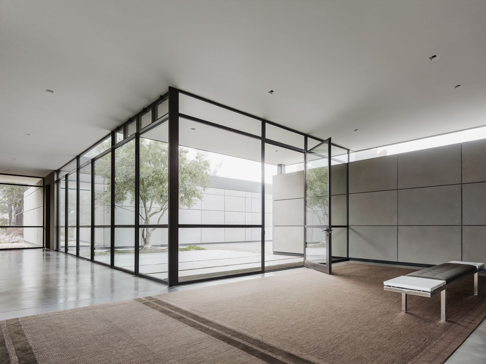
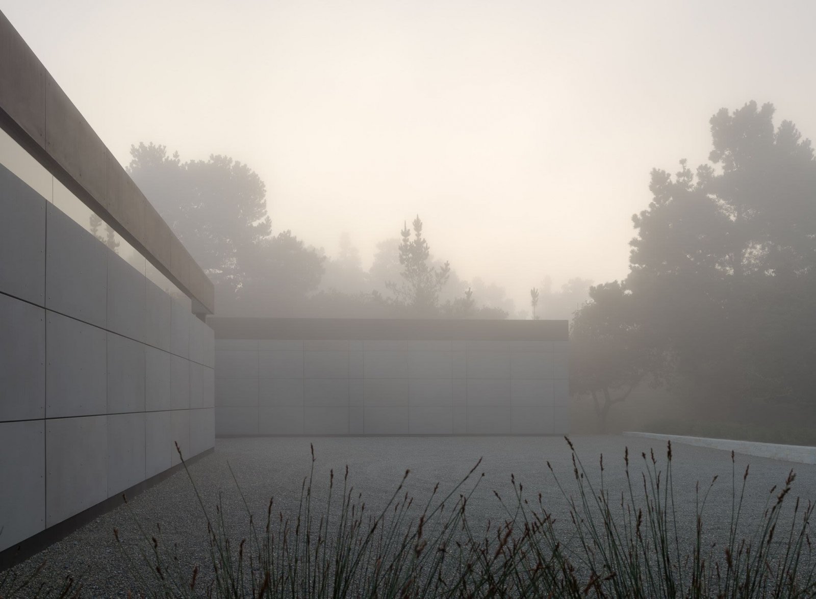
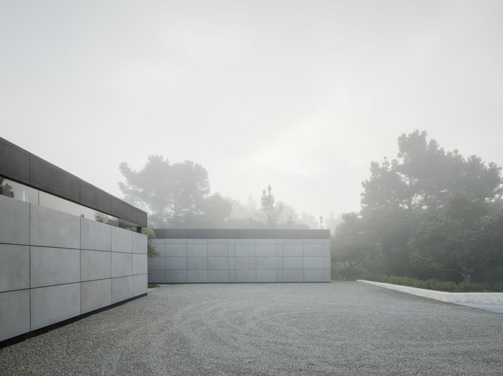
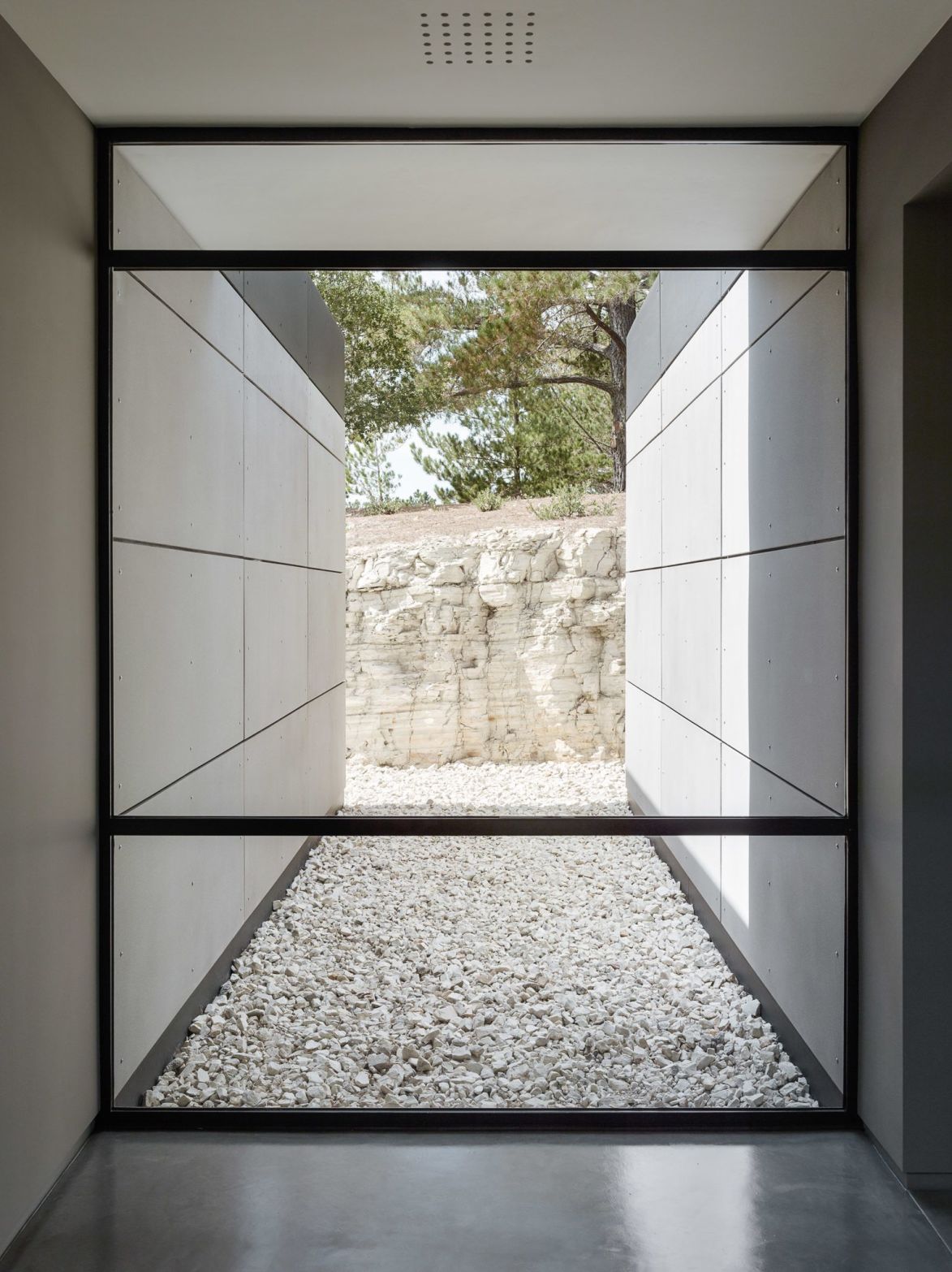
Located in the middle of five acres of land, providing plenty of privacy, sits Carmel House, in the northern California region. It is a hefty 530m² single-story residence designed by renowned architect Jim Jennings for a retired couple. It is a love letter to modern architecture; a fully realised project looking back to stark geometry as the main conceptual argument.
Continue on @minimalissimomag
“In every walk with nature, one receives far more than one seeks”
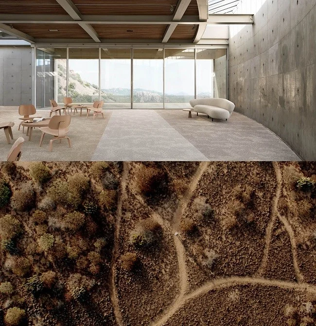
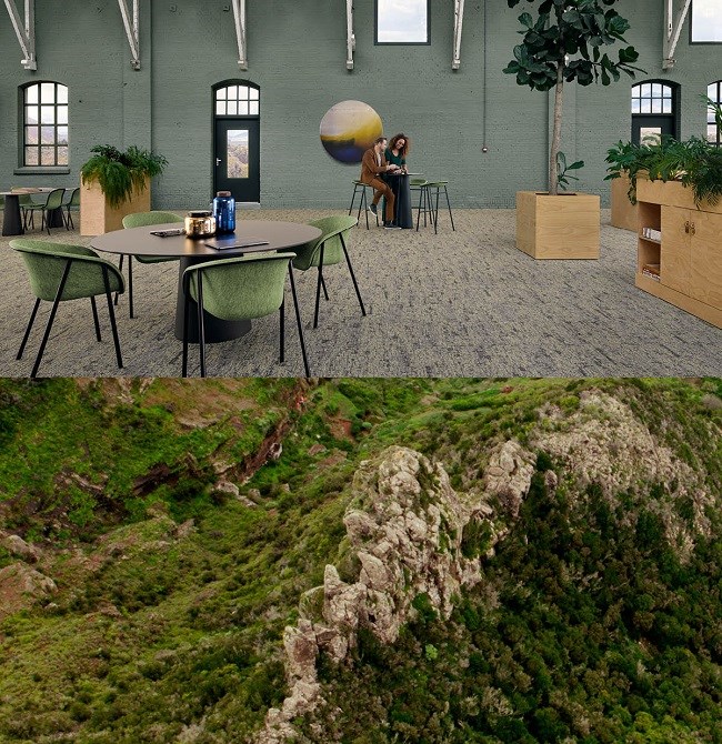
Carpet as landscapes, and landscapes as carpets. A new film for DESSO directed by Thomas Traum as part of their “HUMAN FASCINATION” campaign. Four types of carpets were matched to four landscapes with four characters exploring these landscapes. Additionally, CG artefacts provide a visual link between both worlds, the carpets and the landscapes.
Perpetuum Calendar by OTHR x Yonoh Studio
“OTHR was formed with the belief in surrounding ourselves with fewer and better things. By bringing together the world’s best designers and transformative technologies we created unique objects, with minimal environmental impact. ”
Ico Bottle Opener made with 3D printed bronze: OTHR x Fort Standard
Connection Vessel by Philippe Malouin x OTHR
“We do not manufacture more than is needed, create excessive waste, or warehouse products. This greatly reduces our environmental footprint and gives true meaning to good design.”
EE Juicer by Everything Elevated x OTHR
“By using technologies such as 3D printing, we avoid having to create more objects than there are homes for. Our objects do not physically exist until you choose to own one–each is embedded with a unique number to reflect your participation in its creation.”
VSB Trivet by Visibility x OTHR
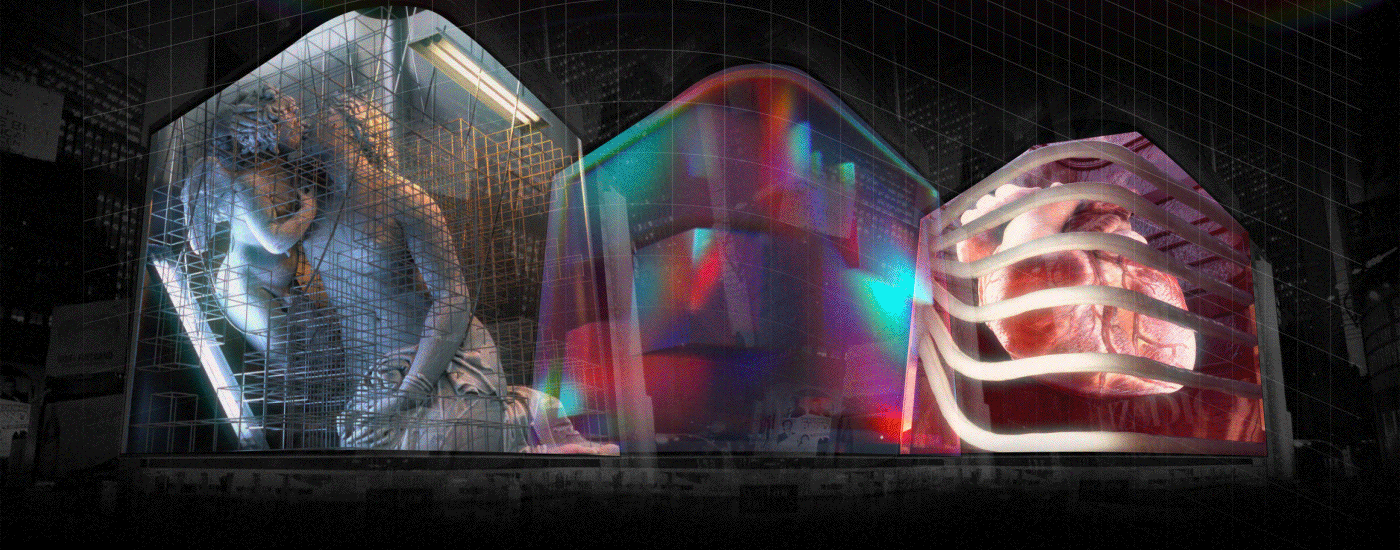
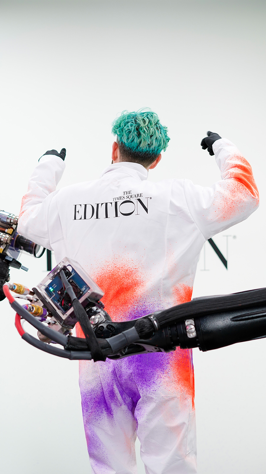
“Times Square is contemporarily known as the one-stop destination for tourists and the one spot New Yorkers avoid with more vigor than jury duty. Legendary Studio 54 founder and luxury hotelier Ian Schrager (@ianschrager), however, is seducing New Yorkers back to the area with the commissioning of two public-facing art projects located on the Jumbotron billboard on the corner of 47th and Broadway in celebration of the opening of The Times Square EDITION (@timessquareedition) “
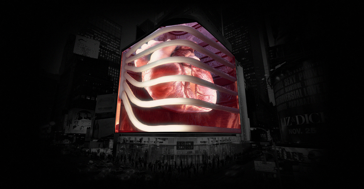
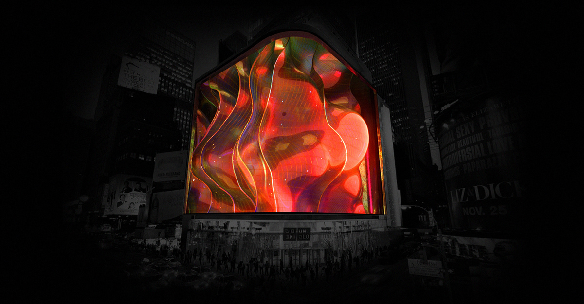
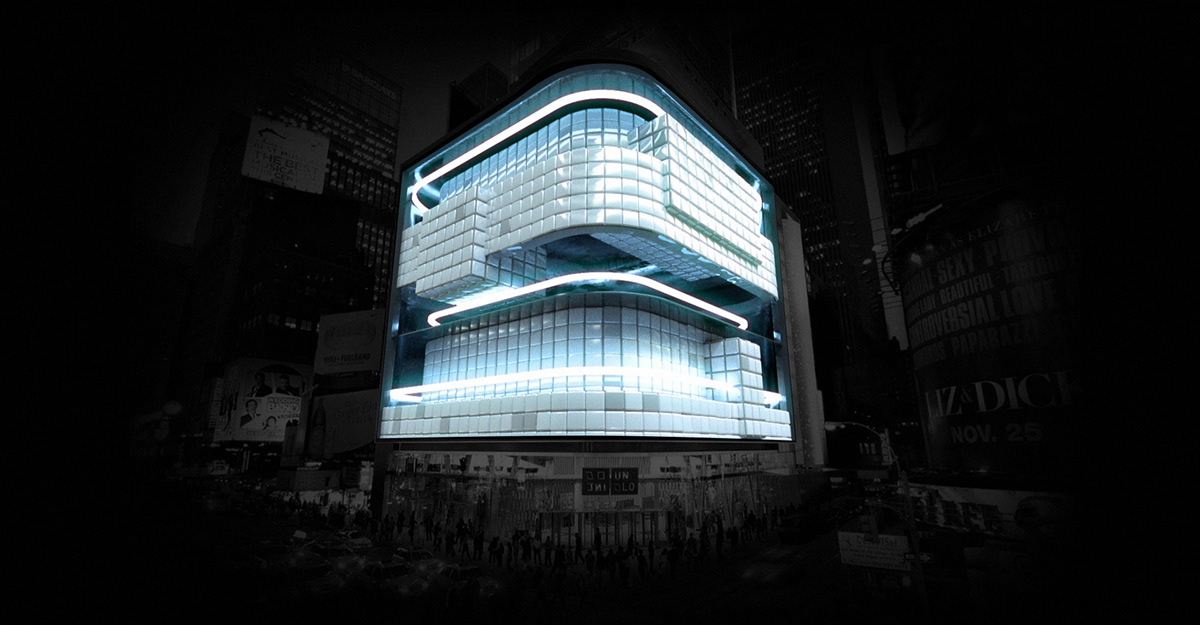
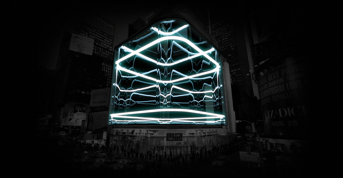
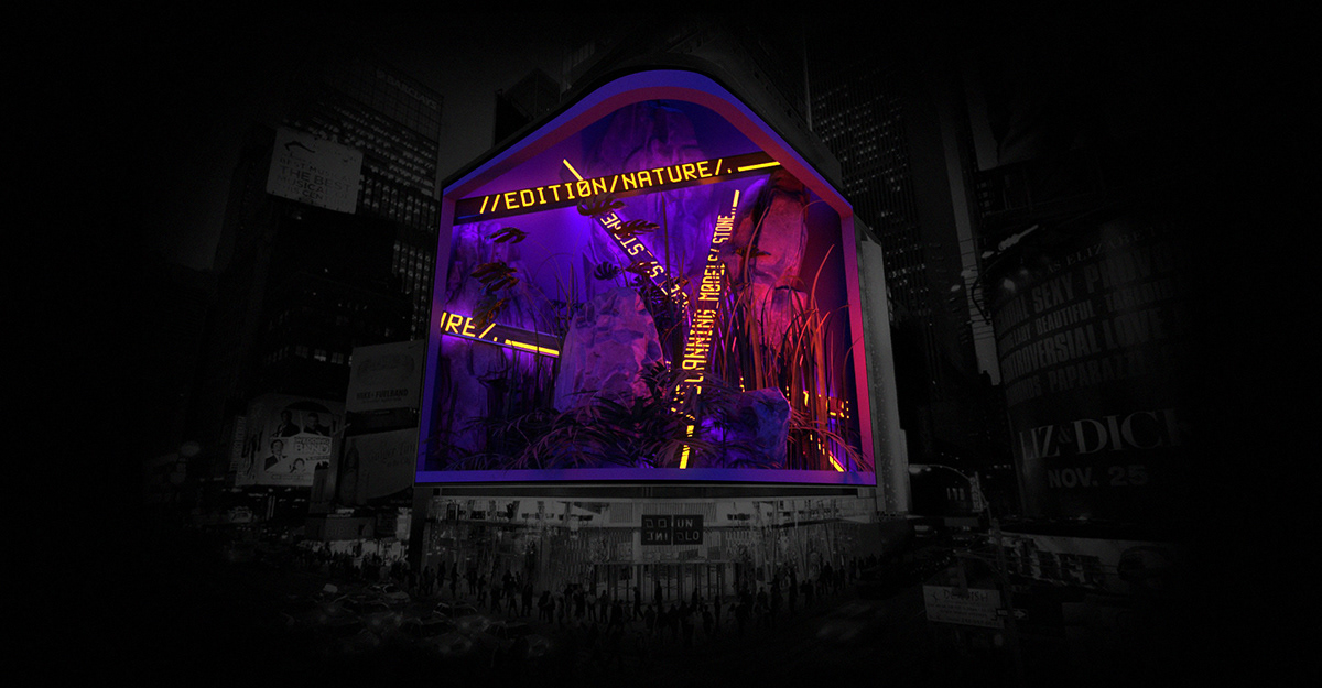
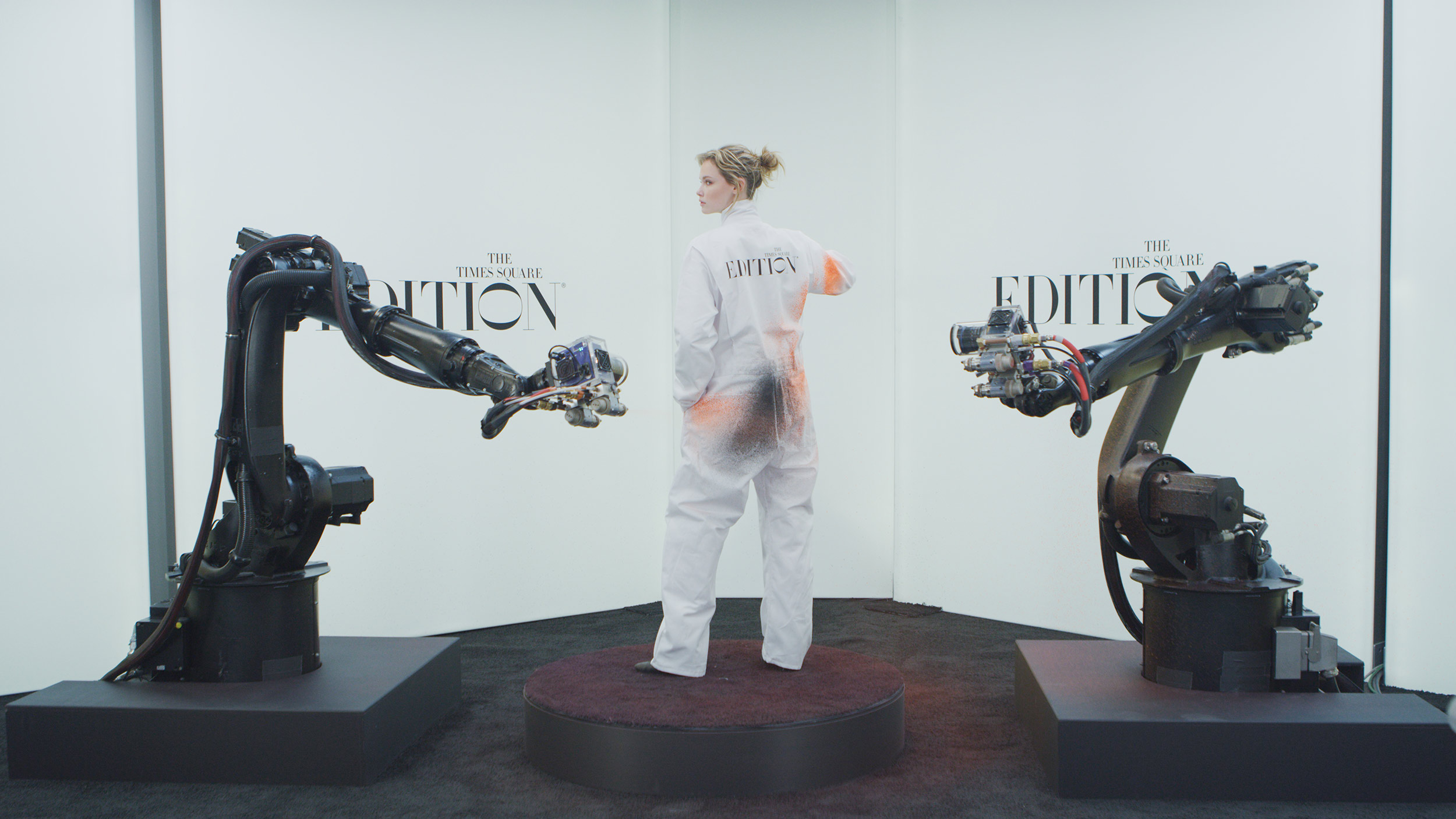
“We wanted to bring something unforgettable to Times Square and create an iconic moment to mark the opening of The Times Square EDITION. The activations will be unique visual experiences that the public can take part in to celebrate this momentous occasion.”
“The new billboard project features a glowing display of urban media art that fuses classic depictions of art and nature with modern technology. Schrager is collaborating with Sila Sveta, the New York-based multimedia design studio that has produced installations for the MET Gala, to bring back the sophisticated glitz and high romance that Times Square was once known for in the 1940s and 50s. What is now blocks of fast food chains and naked cowboys was once a destination for New Yorkers themselves, lined with nightclubs where one could spin to the sounds of Doo-Wop at the start of the evening then end it with a nightcap accompanied by Frank Sinatra.”
Text by Document Journal (@documentjournal)
“Billboards are an important medium in contemporary public art. We want to augment the architectural environment with these new site specific works for the neighborhood”
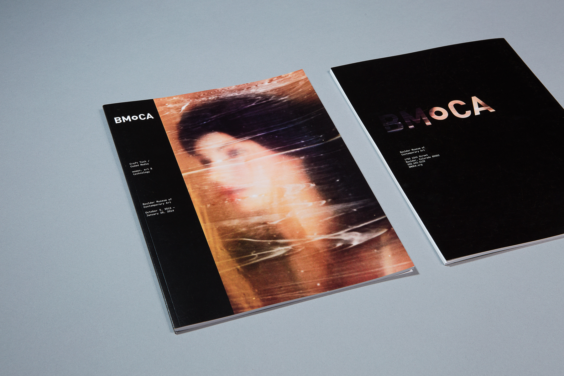
Todd Berger and Lucian Föhr have spent the past 16 years, side by side, practicing contemporary graphic design and brand strategy for cultural and commercial clients. They are co-founders of their namesake studio, Berger & Föhr, based in Boulder, Colorado.
Throughout their careers, they have created a volume of highly regarded brand identities, digital products, and bespoke printed collateral. While broadly international in style, their work spans discipline, sector, and clientele, often defying categorization.
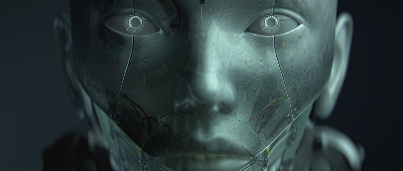
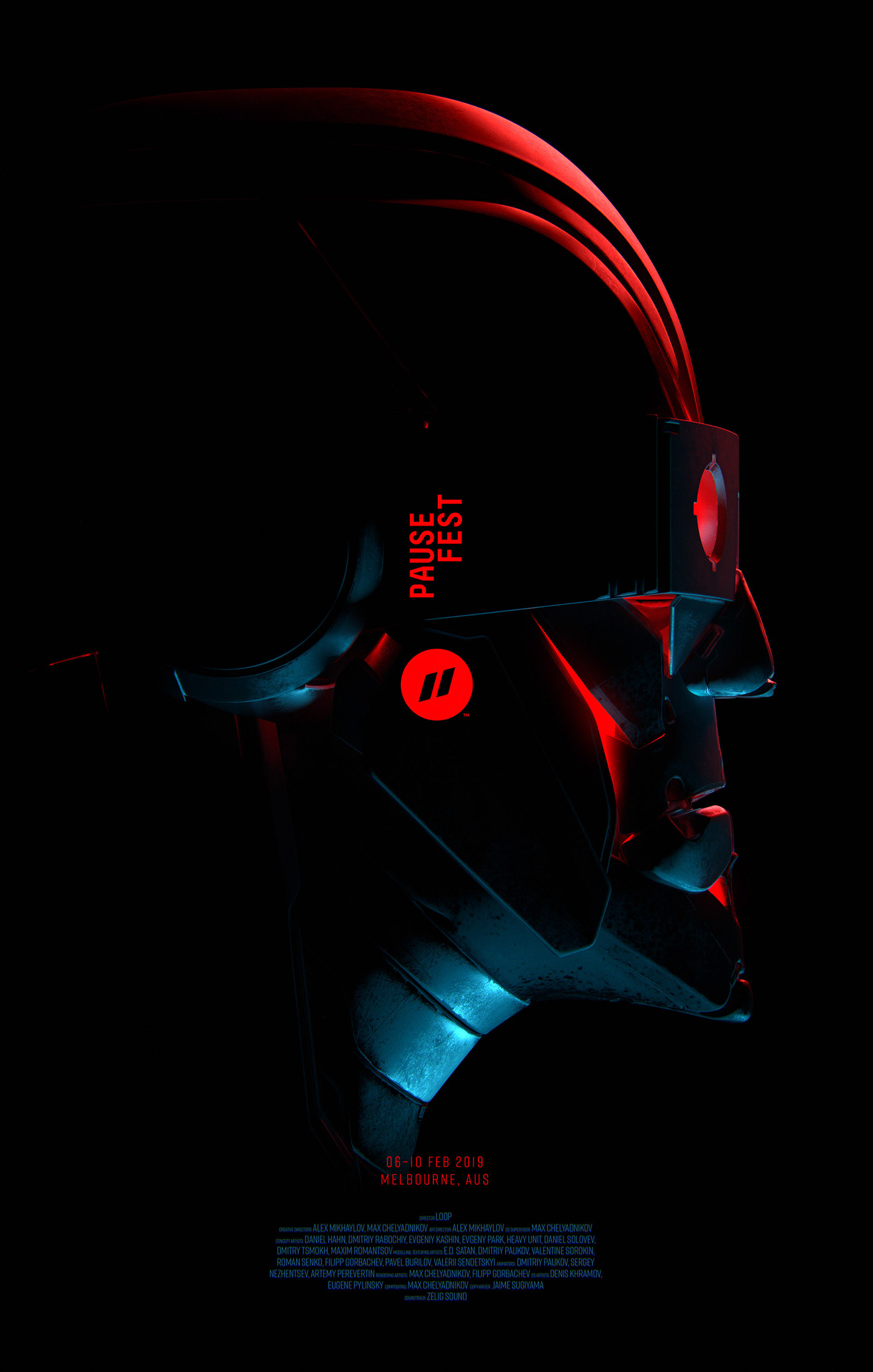
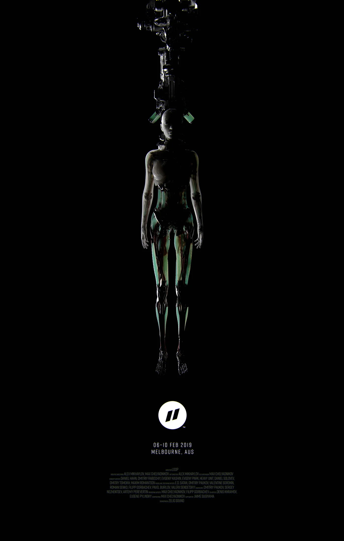
A collaboration between Russian post-production studio LOOP and number of talented artists resulted as a motion reel for the Pause Fest 2019 starting this days in Melbourne.
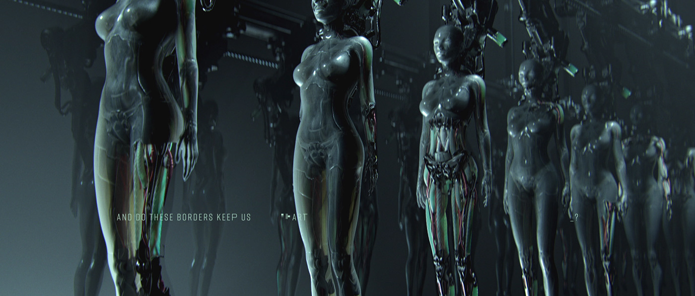
’A New Hope' is a challenging metaphor for everyone affected by the tech age that still considers some developments today as normal in our culture, traditions and society. We are not programmed well enough to foresee what the exponential technology can do to our society. How much are we going to pay for all bad decisions that we are making today? ‘A New Hope’ digs deep into our worst nightmares and what could happen if we loose control over those exponential tech advances. This video depicts how popularity mixed with power can easily transform our society into unpleasant and dangerous place. We have a high hope that our collective consciousness will drive us to a much brighter, safer, happier, inclusive and prosperous place.
Creative Directors: Alex Mikhaylov, Max Chelyadnikov
Art Director: Alex Mikhaylov
CG Supervisor: Max Chelyadnikov
Concept Artists: Daniel Hahn, Dmitriy Rabochiy, Evgeniy Kashin, Evgeny Park, Heavy Unit, Daniel Solovev, Dmitry Tsmokh, Maxim Romantsov
Modelling, Texturing Artists: E.D. Satan, Dmitriy Paukov, Valentine Sorokin, Roman Senko, Filipp Gorbachev, Pavel Burylov, Valerii Sendetskyi
Animators: Dmitriy Paukov, Sergey Nezhentsev, Artemy Perevertin
Rendering Artists: Max Chelyadnikov, Filipp Gorbachev
2D Artists: Denis Khramov, Eugene Pylinsky
Compositing: Max Chelyadnikov
Soundtrack: Zelig Sound
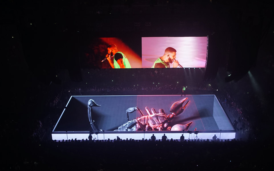
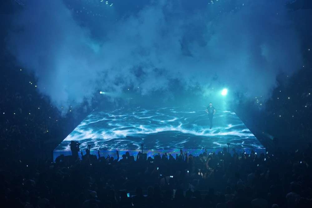
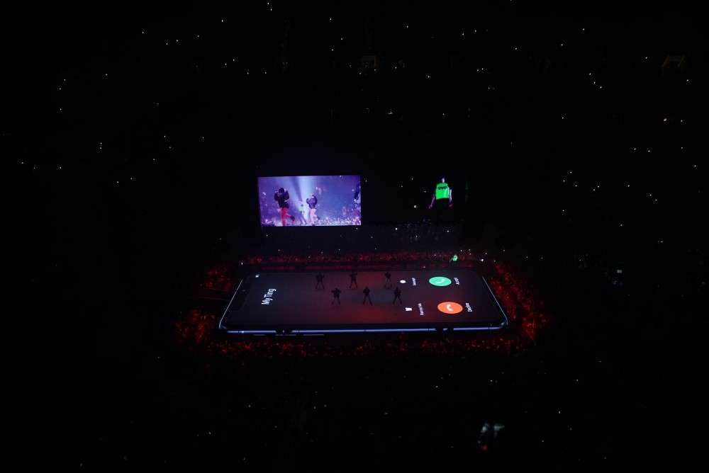
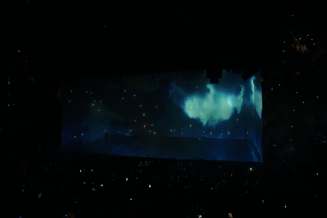
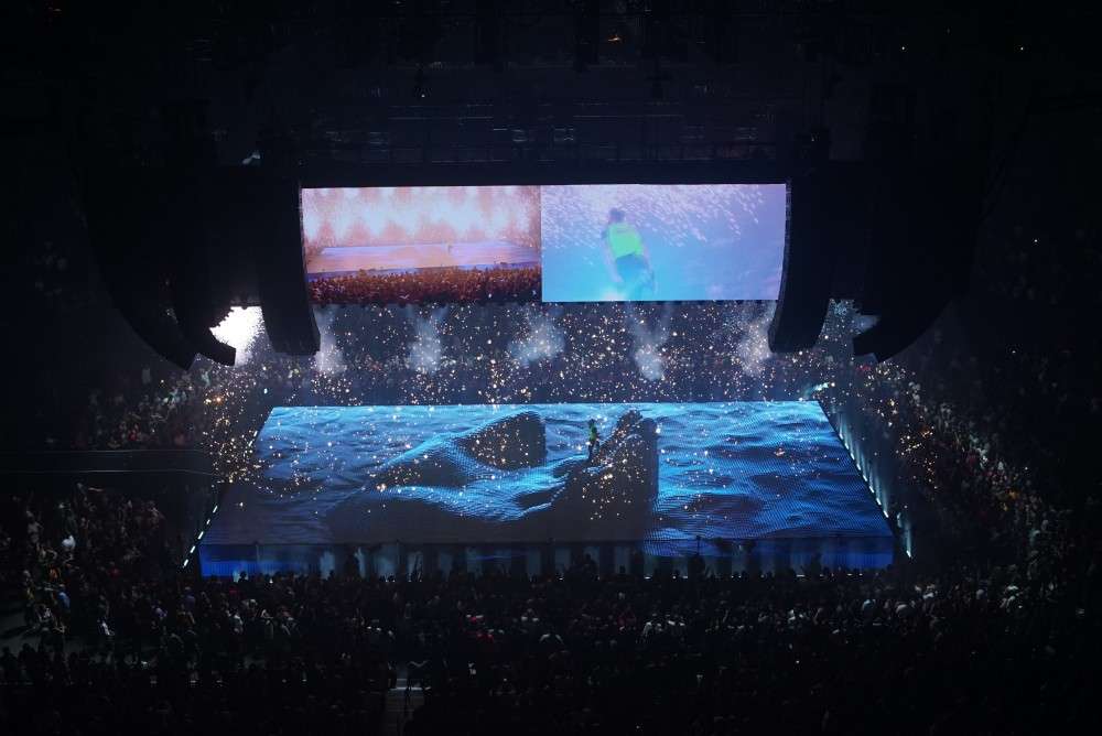
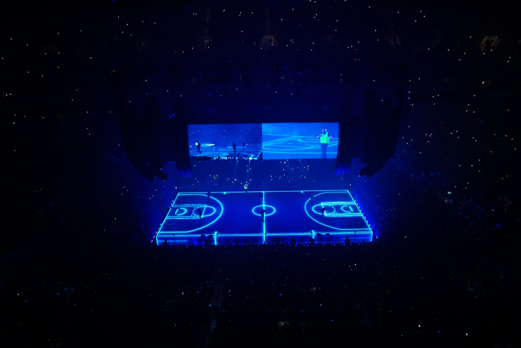
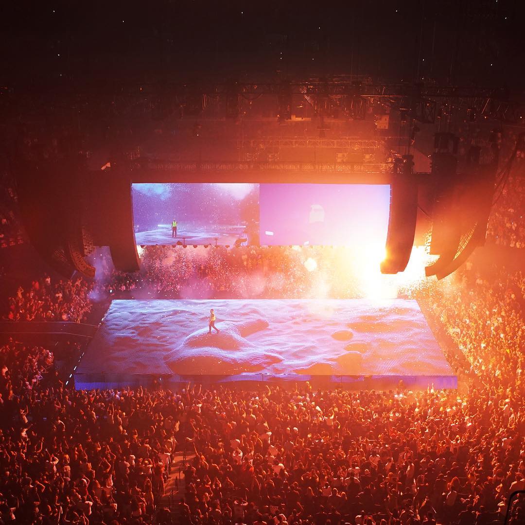
Back in to 2018, it was the most challenging year for the world leading visual effect and stage design studio Sila Sveta, based in Moscow. Through a set of life changing events and creative director Willo Perron they landed with a project for Drake’s tour “Scorpion” - a huge challenge led to 15.6Tb of material and a panic half year of work to release 7 consecutive shows in NYC.

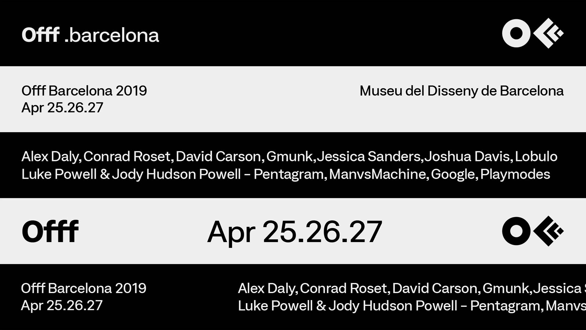
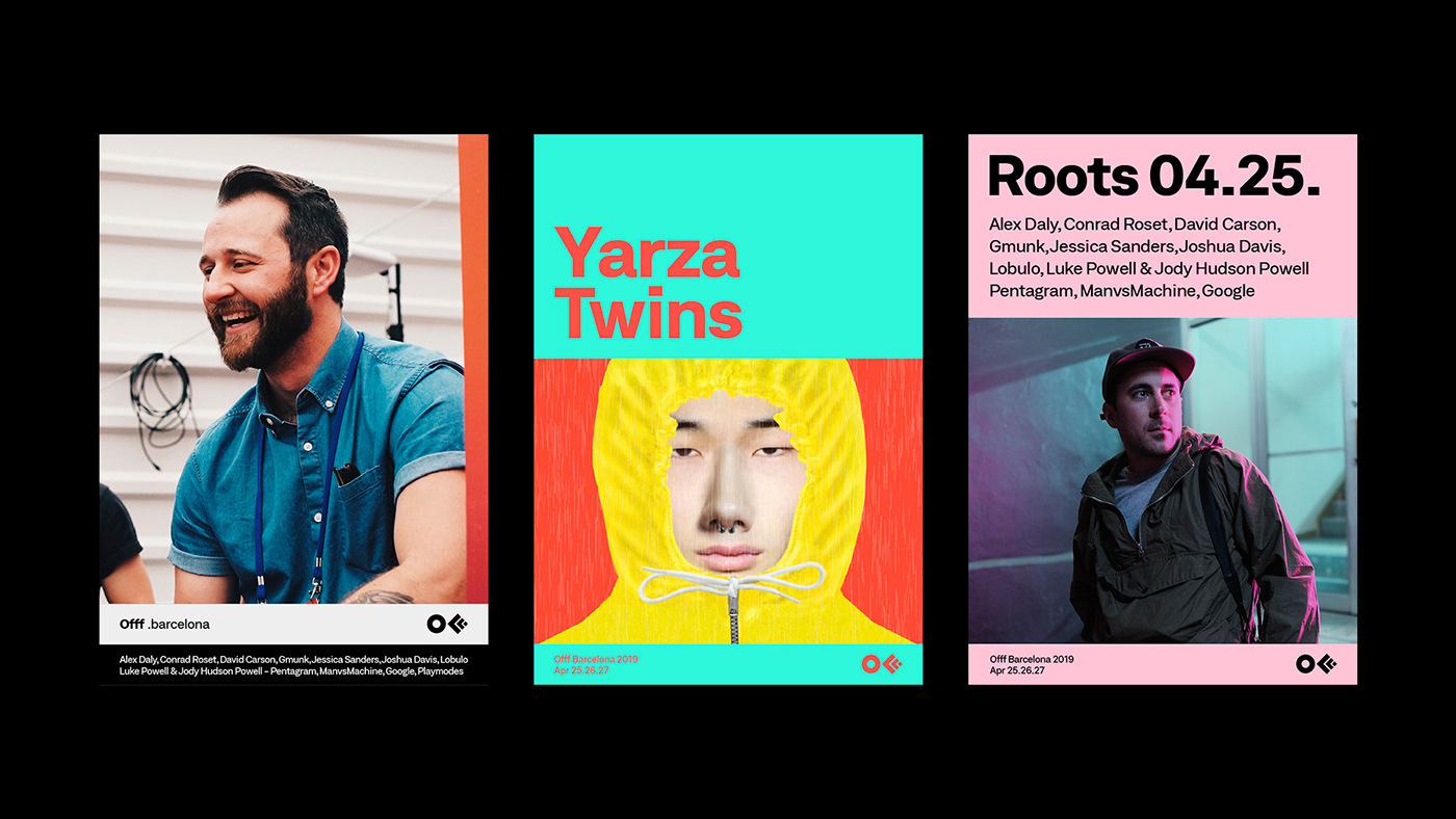
Founded by Héctor Ayuso over a decade ago, OFFF started as a concept that transformed into an event joining creative talents from all around the world all together in one place. The main goal of OFFF is to become the key meeting point for artists who share the same interests to be in one place. Today, OFFF is more than an event, it is more than a Festival, OFFF has become a community providing the ultimate creativity experience.
In 2013, CROWD studio, one of the most talented Barcelona based digital and design agency, has transformed the famous 3 “FFF” into one icon, it was the birth of the official OFFF logo that maintained its presence for 5 years. With with over 18 years of content and a Festival that is ever-evolving, growing every year to become one the most important event to attend worldwide while providing endless innovation, it was time for a change. The OFFF icon has finally become visually recognised by everyone, so it became unnecessary to conserve the 3 “FFF” in the logo. The OFFF icon is now visually abstract, simplified and more compact thanks to re-thickness of the symbols.
“OFFF has been conveying one true message: “our audience, our speakers and our attendees are our base. Without them this wouldn’t be possible” so for such an important brand, user-experience is very crucial. We had to create something valuable for both, past attendees and new comers, to understand the message behind OFFF and to be able to navigate through 18 years worth of contents. Starting with the typography, the most important element to the human being’s eyes, we decided to work with a corporate font, showcasing some seriousness yet with a touch of flexibility.”
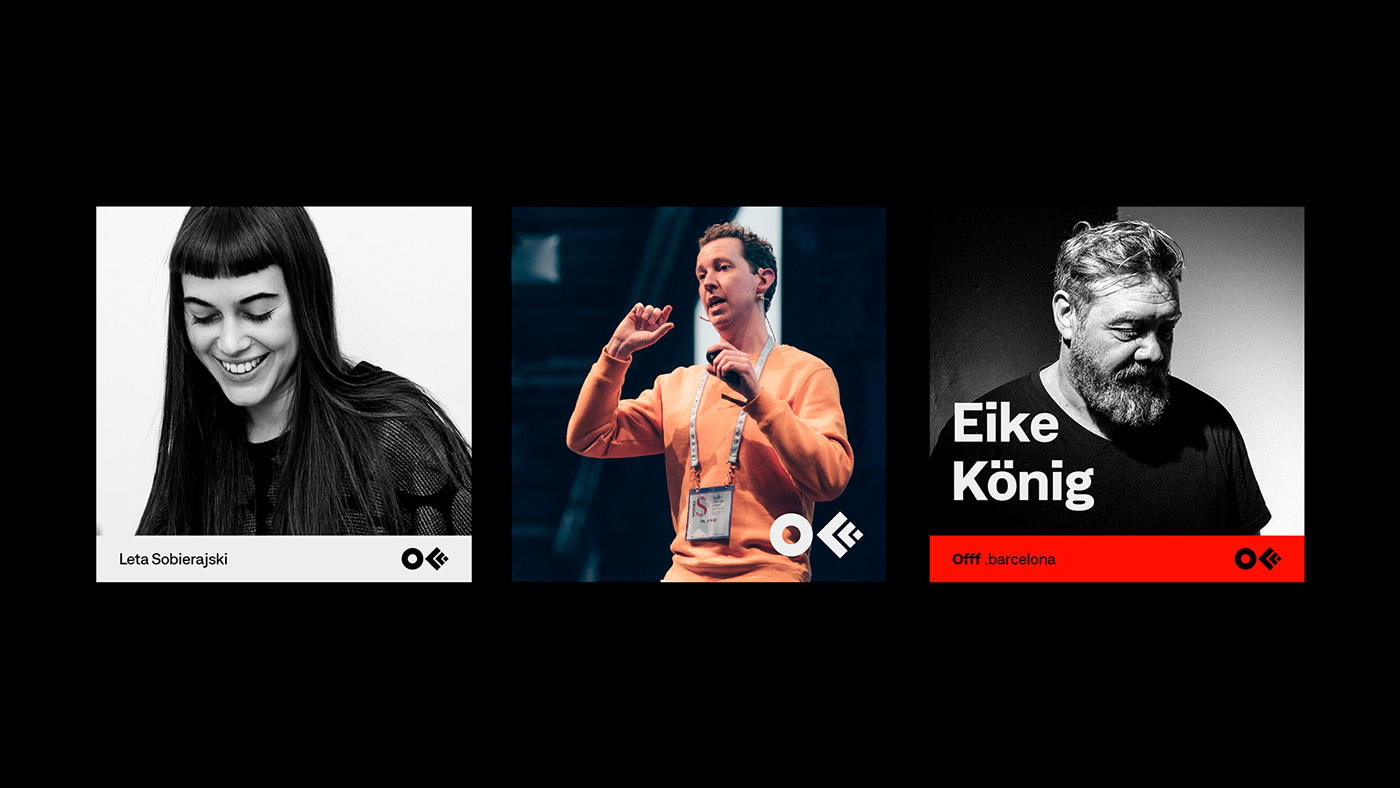
“From concepts to various visual campaigns in every edition and with over 8 OFFF on Tour cities, OFFF Festival is always changing its aspects. But the unity of the brand and the team behind it is the Festival's foundation. Over the past few years, we have noticed an overall shift in the brand’s identity. OFFF, the brand proving itself with the concept of having no brief and giving the complete freedom plus the invitation to create, this also had its consequence. We noticed that with so many openness, the brand unfortunately lost its visual presence and visual aspect throughout the Festival, online and onsite. So how do we showcase the dynamic aspect of the brand while maintaining its base? By creating a definite strategy in the brand’s communication structure and building a branding system.”
“With this new approach we are adding more control to the brand use, where the brand gets more identified with the ability to adapt to other contents therefore the Festival becomes more firm and more strengthened.”
“While using this new system of communication grid, the website become one dynamic block of contents making it easier for the user to adapt. This allows us to recreate the whole website as a platform and as an archive of news, past speakers, new speakers and events. An organised clean space.”
Barcelona-based designer Ezequiel Pini creates an ongoing project “Social Workout” as an art director of Six N.Five team best known for their CG masterpieces
“Squarespace is one of very few technology companies that can truly call NYC home. The city has inspired our attitude, our aesthetic, and our mission to democratize good design for every ambitious entrepreneur, artist, or visionary with a dream. As we began to rethink our brand identity, we knew we needed to find a way to make New York a bigger part of the story.”
“New York is a study in movement; like jazz, it constantly heads in unpredictable directions. Since much of our output is interactive and screen based, we knew the brand needed to make sense in motion. So we developed a kinetic identity system that dimensionalizes our name and reinforces the two syllables in Squarespace.“

In 2017 Radugadesign presented the audiovisual performance "Cognition" (for Asko brand) in Stockholm City Hall developed in the collaboration with composer and pianist Nikola Melnikov.. The installation of "Cognition" is an expression of striving for the perfect shape. Everything can be perfect–whether it is a geometric figure or a person.
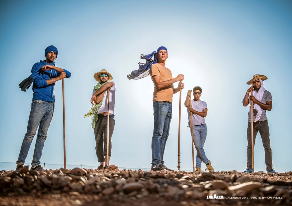
The work covers an area of 8,000 square metres and portrays a local inhabitant, Maria Paula. It is meant to symbolise the need for new generations to take care of the land and the planet
After years of armed conflicts and the spread of illegal farming in Colombia, the fields are lush again with the help of a project promoted by the Giuseppe and Pericle Lavazza Foundation. The aim is to offer support for the development of sustainable farms by training local communities to use new farming techniques and by providing internet access
The work was created using water and 100% biodegradable materials. Saype said: ‘What is interesting when I paint on grass is how quickly the ecosystem regains life. Flowers start blooming again, butterflies fly just above the grass, thousands of ants start moving around. It’s really incredible how nature takes over my artwork’
The painting, measuring five metres by three, was painted in three days and then installed on a raft secured to the mangroves
The Mikoko Pamoja organisation plants 4,000 new mangroves in Gazi each year to protect coastal communities from floods and tsunamis and to act as a natural carbon sink. Now that Gazi’s forests have begun to grow thicker again, many aquatic animals have found a perfect habitat
‘Art comes after nature because humans have developed a powerful capacity to observe the world around them and reproduce it. I believe it is nature that has given an essence to art’ – Mantra
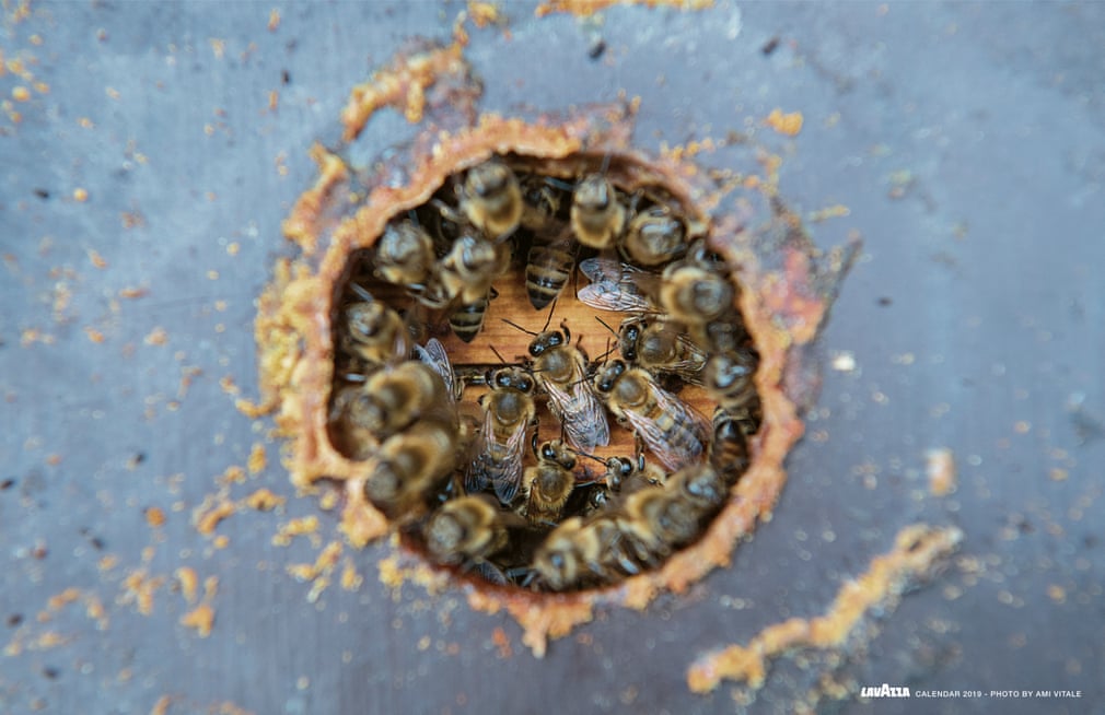
The mural was surrounded by six bees to celebrate the insect that symbolises the rebirth of Genk
The mural was created in five days using water-based wall paint. ‘When I draw a grey city, I feel that I have to add colour as a complement. The message thus becomes to think of spaces in a more sustainable way, as in Genk’ – Millo
A former industrial and coalmining area, today Genk is in a new cycle of sustainable development and has welcomed the return of bees. The redevelopment of the abandoned industrial area has created 69 new gardens where people can meet and grow organic food, and the efforts of local residents have created the ideal conditions for bees to thrive
The image is meant to symbolise the ability to reuse water to create a greenbelt around the city and so protect it from sandstorms
The inhabitants of Ouarzazate, a city known as ‘the door to the desert’, have protected it against sandstorms by creating a greenbelt around the city using innovative irrigation systems. Waste water is recycled, collected, filtered in reservoirs and then pumped into the greenbelt with the aid of clean power generated by the biggest power plant in north Africa
Perpetual Flow extends over 37,500 sq metres and was created using rakes, stones found on the site, 36 tonnes of dark gravel, and vegetable oil
The work is made up of six oil-painted plexiglass sheets up to 120cm high
The Wildlife Friends Foundation of Thailand and other organisations have regenerated degraded forest land, creating a perfect habitat for gibbons, above all, but also elephants and numerous other species
‘The portrait of a proud woman becomes at one with the trees and foliage because of the transparency of the plexiglass,’ according to the artwork’s description
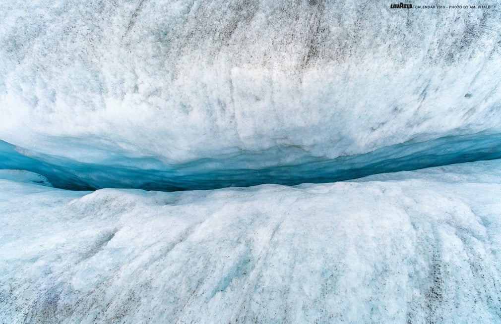
The work was created using non-toxic, 100% biodegradable materials and portrays two children sheltering under a blanket, symbolising the future generations who face challenges such as climate change and melting glaciers
The Rhône glacier is an expanse of ice and snow 10km in length and 1km in width. During the ice age it covered all of Switzerland. Today it shrinks by approximately nine metres in length and depth each year. People from this area have decided to try to protect the glacier using white geotextile blankets that reflect the sun’s rays
‘These mountains instil a sense of respect at first glance. Yet, when we reflect that the glacier has shrunk considerably in just a few years, it is easy to see how much it needs to be protected. We are at a crucial juncture for action’ – Hula


![ProEXR File Description=Attributes=channels (chlist)compression (compression): Zip16dataWindow (box2i): [0, 0, 4499, 2999]displayWindow (box2i): [0, 0, 4499, 2999]lineOrder (lineOrder): Increasing YpixelAspectRatio (float): 1screenWindowCenter (v2f)](https://images.squarespace-cdn.com/content/v1/56e33409d210b8a4c7e973c9/1573899774436-GCAASCYIXDJNGW9NYNCH/TEST+COMPO+B01.jpg)