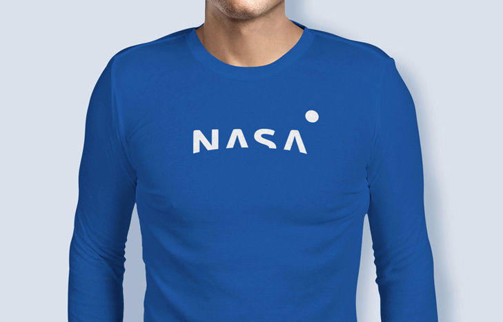
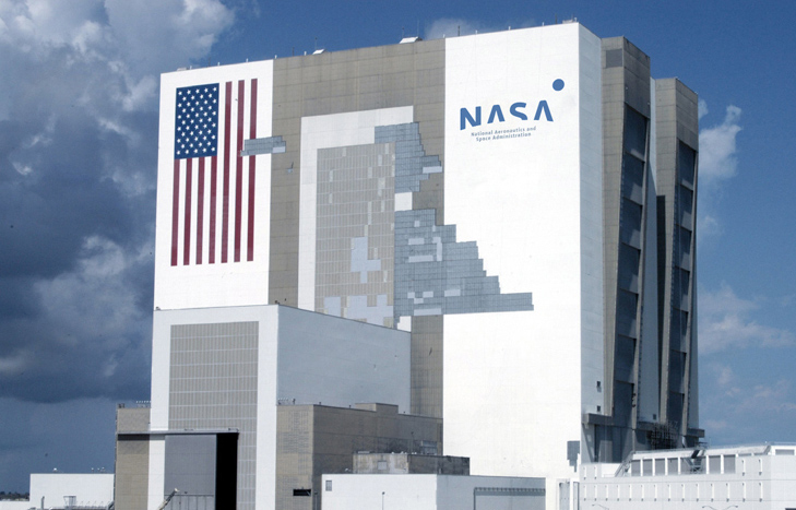
New NASA Logo Concept made by Russian
"The Russians were NASA’s chief rival during the space race, so it’s ironic that it took a young Russian named Max Lapteff to design a smart, speculative rebranding of the National Aeronautics and Space Administration logo. The mark pulls off a hat trick, referencing NASA’s illustrious past, nodding to its dreams of taking us to new planets, and ditching the dated features of the old logo." says Wired and this story seen ironically funny in all possible ways.


